Behind the Scenes, Book Design
Designing Francine River’s gift edition of A Lineage of Grace
Having the honor to re-design Francine River’s A Lineage of Grace as a gift edition was total joy, as I loved reading the fictionalized stories of the five women in the lineage of Christ. Francine makes them come to life as you enter into their culture, which is so unlike ours. Designing the cover was also like coming full circle for me, as I designed the original set of novellas.
In developing the new gift edition, the Tyndale House Publishers fiction committee decided to create a classic package for these novellas, since this story is historical fiction and will be around for generations to come.
While brainstorming the concept for the new cover, I made a word list, which included the following: connection, intertwining, rooted, faith, beauty, feminine, family tree, grace, and unlikely stories. I also thought a lot about the prophecy in Isaiah 11:1 “Out of the stump of David’s family will grow a shoot—yes, a new Branch bearing fruit from the old root.” I thought about how God chose to redeem these different women in such a powerful way, that changed all of history. I thought about how He meets us in our brokenness to build something strong and beautiful, for His glory.
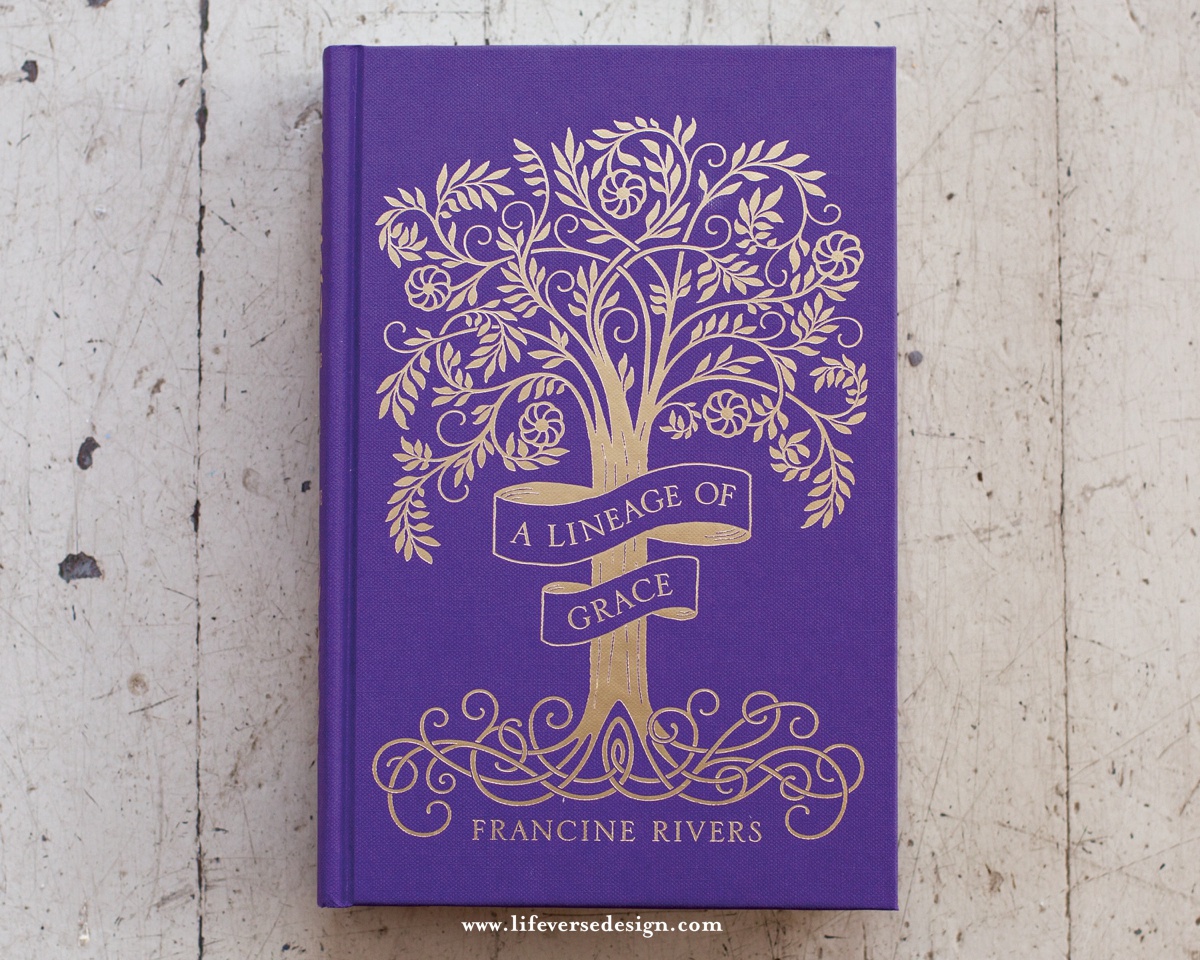
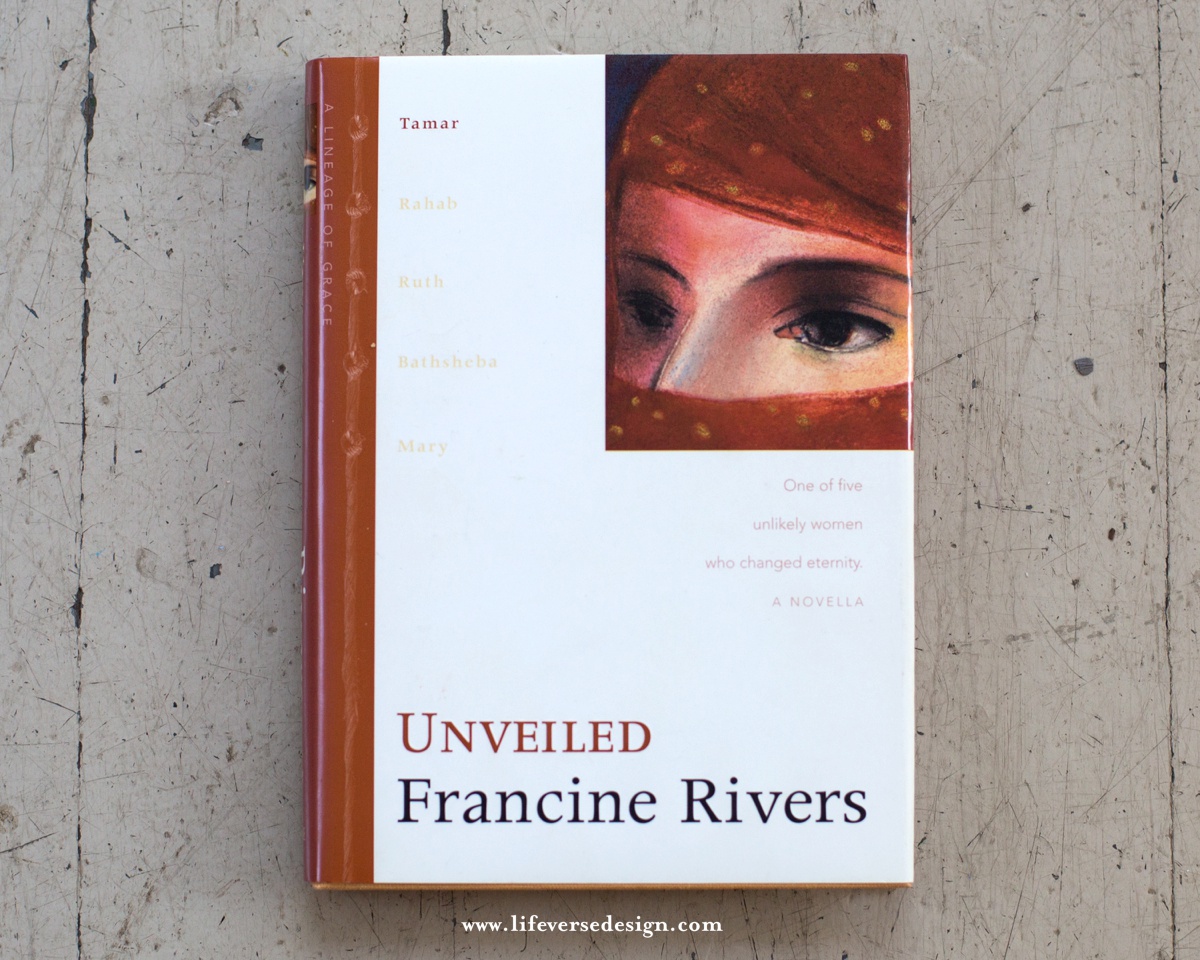
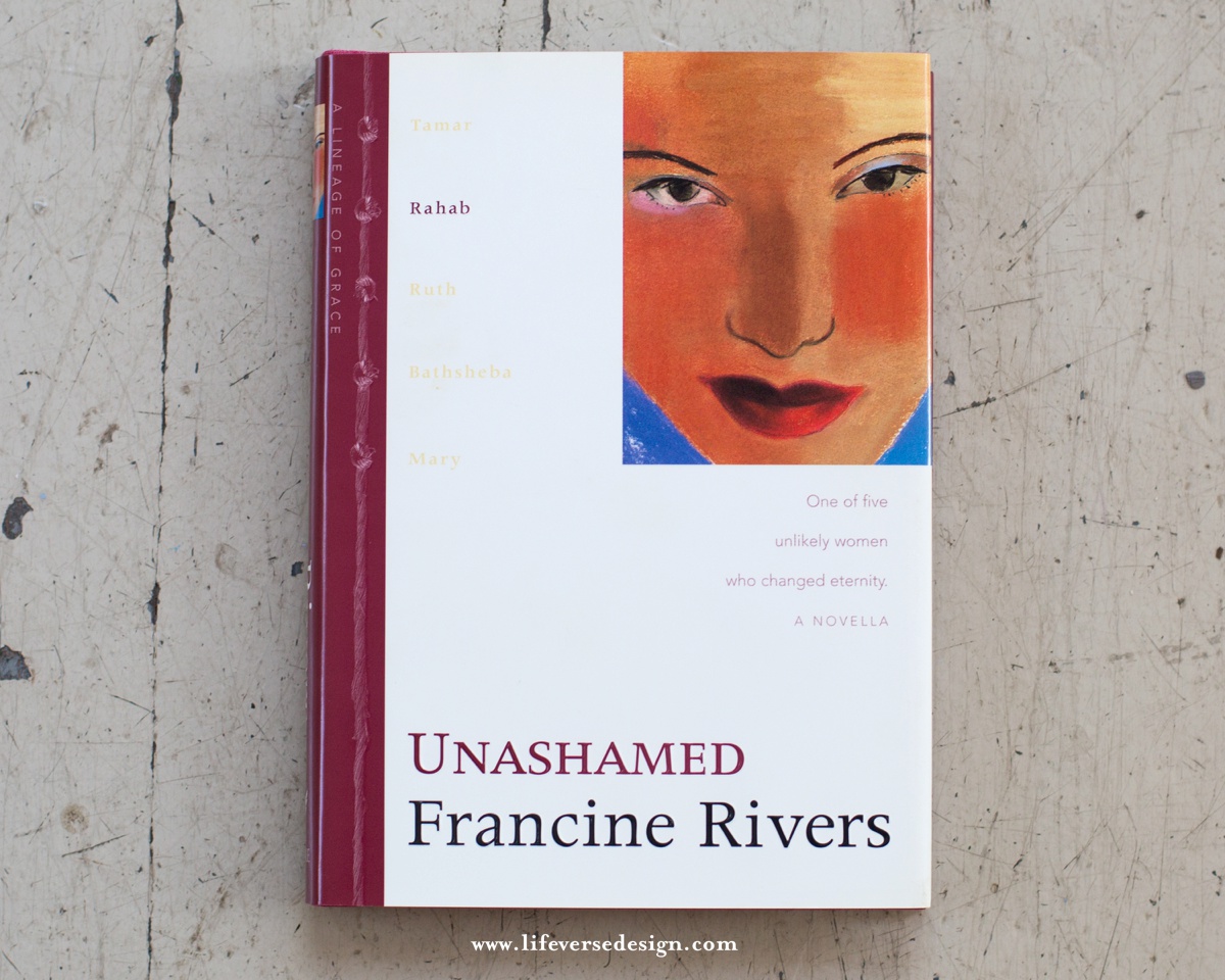
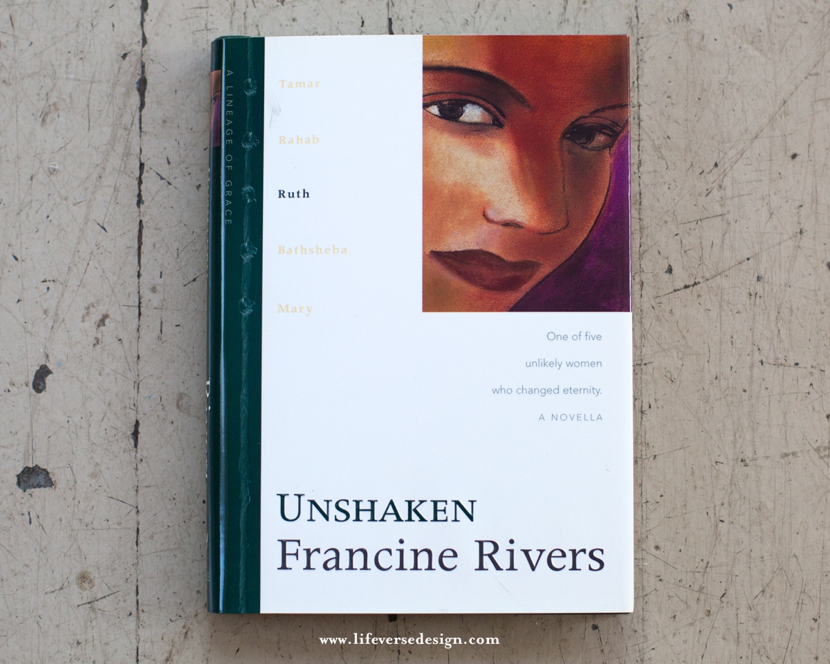
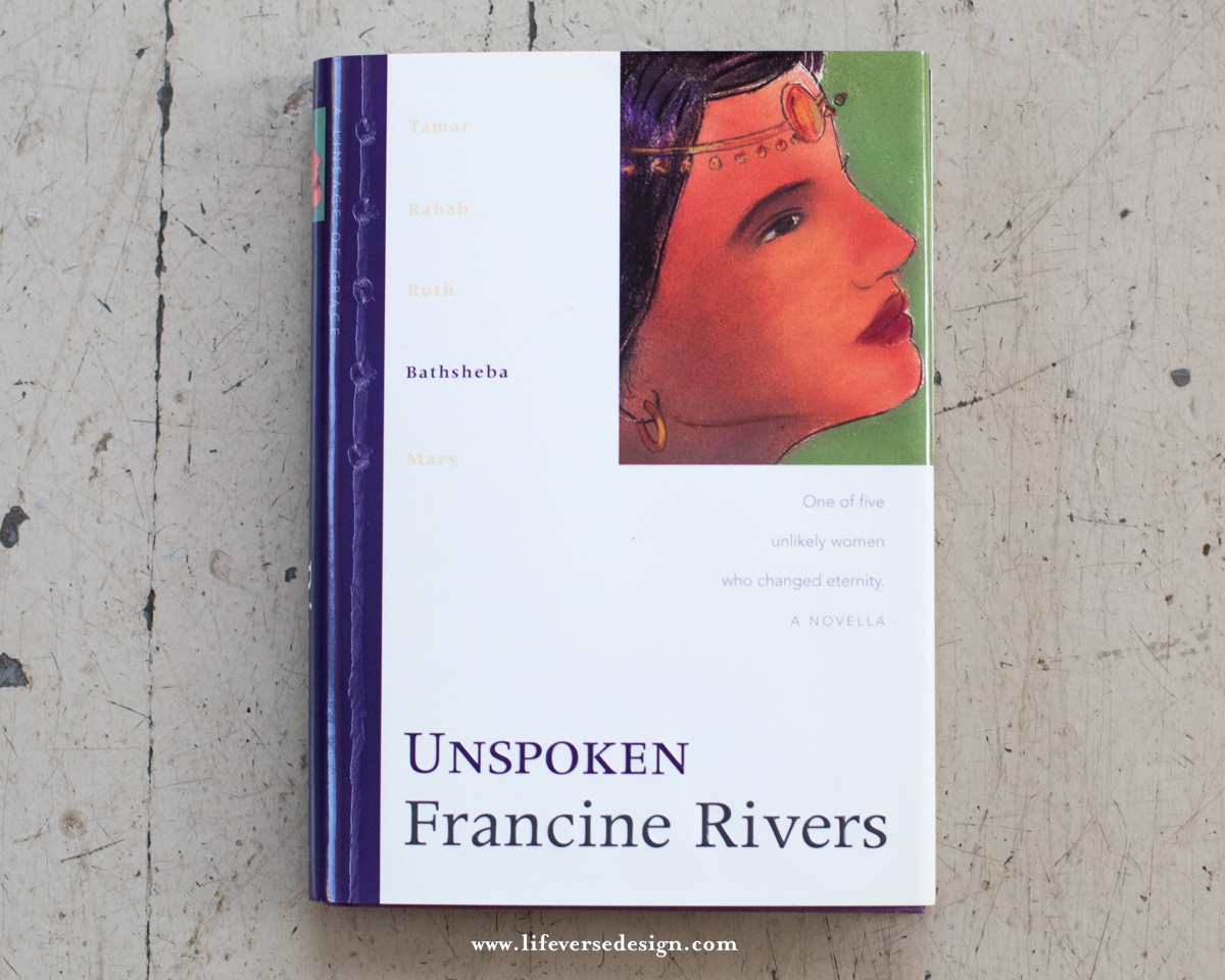
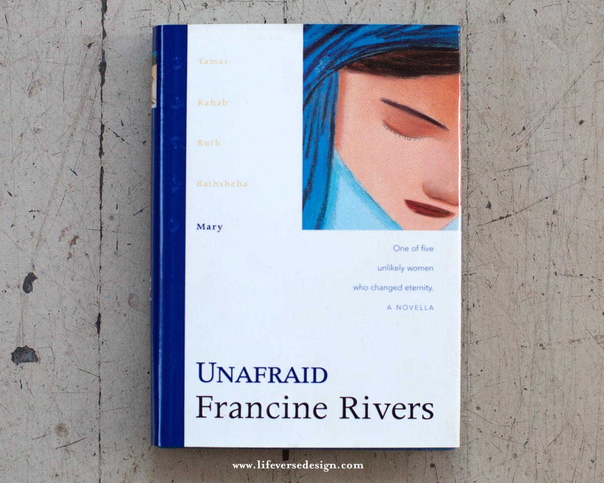
I went back to those original novella covers and thought about the string I used to show their connection. The 5 knots represented the 5 women’s lives and how they became threaded together. The knot was a landmark of their spot in the lineage of Christ. It was their mark on the world.
I also did a ton of research, looking at old, vintage books and was so inspired by the intricacies and elegance of the foil stamping, as well as the simplicity of the typography.
In thinking through color, I wanted to use either red to represent the blood line of Jesus Christ or purple to represent His royalty. We ended up using purple, since Francine’s gift edition of Redeeming Love uses crimson red.
Then, I started sketching.
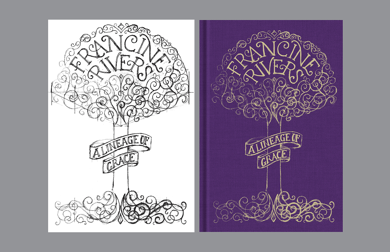
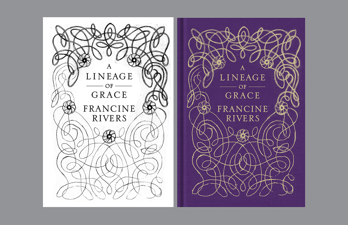
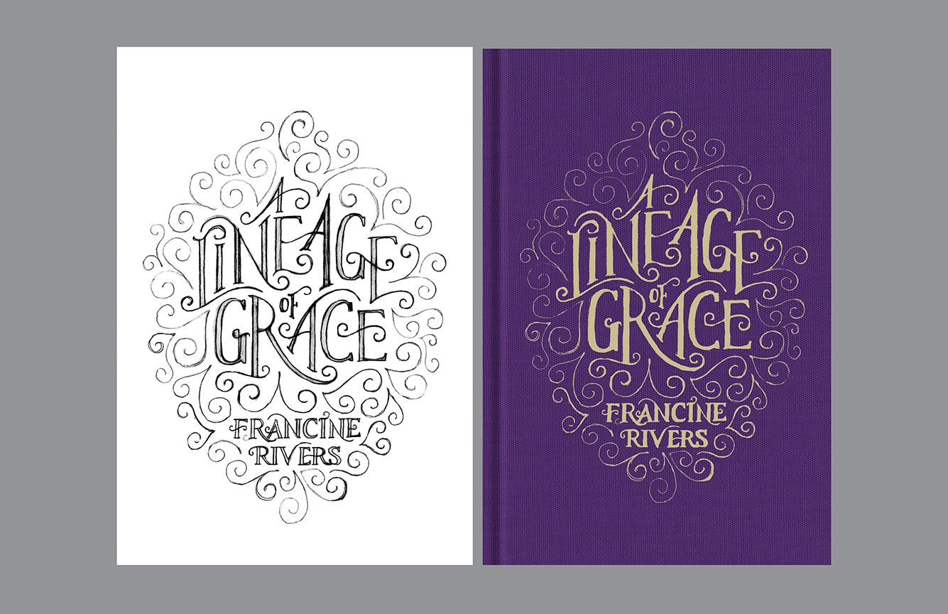
Since my sketches looked like a child’s drawing, I immediately turned to one of Tyndale’s in-house artists, Lindsey Bergsma, who is gifted at both hand lettering and illustration. I had her develop three concepts: the tree, a classic interwoven look, and a more contemporary hand lettered style.
In the end, we stuck with the tree, as we all loved the symbolism of the family tree that the women are a part of. As you can see, Lindsey’s final tree is different from where we started. Her first tree looked more fairy-tale-like, and since this is serious, historical fiction, we wanted the tree to have more substance, while remaining elegant. We moved Francine’s name out of the branches & placed them in the roots because Francine actually wanted less emphasis on her byline! {What New York Times best selling author wants her name smaller?!!! She is the real deal, people!} In the final art, there are 5 flowers in the branches, symbolizing the 5 women, which harkens back to the original novellas having the 5 knots on the cover. Both the branches and the roots are always intertwining, as I really wanted to emphasize how God wove the lives of the five women in the lineage of Christ in such a beautiful way.
Lindsey painstakingly and meticulously developed the art to be perfectly balanced and yet have movement and asymmetry to create an organic look. She created a grid and sketched (over & over) the roots and the branches, always being mindful where the lines would overlap. Then, she scanned in her sketches, cleaned them up in photoshop, and took the art into Illustrator where she re-drew the entire piece as vector art. Without her creativity, this cover would not be what it is today & I am so thankful for her!
I could not be happier with the final result, and I pray this book encourages other women, as it has encouraged me!
Grace & Peace,
Julie